
时间:2025-03-21 11:53
人气:
作者:admin
本文希望从写死的代码慢慢引入 WPF 的一些机制。
我们想要修改 Button 的背景色但是效果非常不理想,默认的 Button 样式是完全无法给大家看的,改造 Button 的方法是借助 Style 在 Template 中自定义 ControlTemplate(Style 并不关键)。
<Style x:Key="Button_Test_Style" TargetType="Button">
    <Setter Property="Template">
        <Setter.Value>
            <ControlTemplate TargetType="Button">
                <Grid Width="100" Height="40">
                    <Border Background="Aqua" />
                    <TextBlock Text="Hello, WPF!" />
                </Grid>
            </ControlTemplate>
        </Setter.Value>
    </Setter>
</Style>
Style 在自定义控件的部分并不关键,实际上你完全可以使用 Button.Template 属性展开然后实现同样的效果,但是缺少复用性。
虽然它现在变得比较好看了,但是这个 Button 样式完全是一个植物人,成了一个赛博手办,好看固然是好看,甚至是可以执行 Click 事件来进行交互的,但是我们本来可以设置 <Button Background="Red"/> 不能用了。
之所以不能用,原因是因为你在 ControlTemplate 的地方确实没有让 Button 的 Background 发挥作用。
这种行为就好像下面的代码一样:
private void SayHello(string name)
{
    Console.WriteLine("hello, world!");
}
请问,在这个代码片段,一个名为 SayHello 的函数中,参数 name 的意义是什么?
为此,WPF 引入了依赖属性 DependencyProperty 的机制来让它就像函数的参数意义,能够为 ControlTemplate 里面的东西带来意义。
在 WPF 的控件中,大部分属性都属于依赖属性,对于 Button 来说,Background 是依赖属性,Content 也是。
我们是必不可少要学习自己创建自定义控件和自定义的依赖属性的,但是在这一部分,我们来看一下如何使用自带的依赖属性为原生控件进行自定义。
<Style x:Key="Button_Test_Style" TargetType="Button">
    <Setter Property="Template">
        <Setter.Value>
            <ControlTemplate TargetType="Button">
                <Grid Width="100" Height="40">
                    <Border Background="{TemplateBinding Background}" />
                    <TextBlock Text="Hello, WPF!" />
                </Grid>
            </ControlTemplate>
        </Setter.Value>
    </Setter>
</Style>
总而言之,使用 {TemplateBinding XXX} 对控件的依赖属性进行使用,有的时候直接使用 TemplateBinding 可能无法生效,所以你可以使用下面的平替,下面这种的泛用性会更强,但是没有 TemplateBinding 的写法那么方便,属于是比较 Hack 的写法,我们在后面的介绍中有一处只有它才能实现的效果。
<Style x:Key="Button_Test_Style" TargetType="Button">
    <Setter Property="Template">
        <Setter.Value>
            <ControlTemplate TargetType="Button">
                <Grid Width="100" Height="40">
                    <Border Background="{Binding RelativeSource={RelativeSource Mode=TemplatedParent}, Path=Background}" />
                    <TextBlock Text="Hello, WPF!" />
                </Grid>
            </ControlTemplate>
        </Setter.Value>
    </Setter>
</Style>
当你知道了 Background 和 Content 都是依赖属性之后,我们目前没有做 TextBlock 呈现内容的参数化模板绑定,但是我想你也应该知道怎么做了。
你在进行编写的时候,可能会遇到智能提示的问题,你会发现你在为 TextBlock 的 Text 进行绑定的时候,可能会发现你在 VS 的智能提示的小窗里并没有办法找到 Content,这并不是 VS 出现了 BUG,VS 的消极反应也并不是在否定你,我们打算在美化完 UI 后,再来细讲为什么 VS 会如此的不配合,为什么在 TextBlock 的 Text 中绑定 Content 是一个不算对也不算错的行为。
<Style x:Key="Button_Test_Style" TargetType="Button">
    <Setter Property="Template">
        <Setter.Value>
            <ControlTemplate TargetType="Button">
                <Grid>
                    <Border Background="{TemplateBinding Background}" CornerRadius="5" />
                    <TextBlock
                        HorizontalAlignment="Center"
                        VerticalAlignment="Center"
                        Text="{TemplateBinding Content}" />
                </Grid>
            </ControlTemplate>
        </Setter.Value>
    </Setter>
</Style>
你可以这样使用:
<Button
    Width="100"
    Height="40"
    Background="LightGreen"
    Content="Hello WPF!"
    Style="{StaticResource Button_Test_Style}" />
在 VS 的 WPF 编辑环境中对于 控件模板 ControlTemplate 和 控件绑定的智能提示来自于 TargetType="Button" 这边对控件的指定,如果没有指定类型,智能提示会完全没有办法给你补全什么有效代码。
我们在写 Background 的时候很顺利但是在 写 Text 的时候遇到了 VS 的阻挠,即便如此我们硬写还是写出来了。
效果还不错是吧?
你知道吗,WPF 的很多控件是支持嵌套的,就像下面这样:
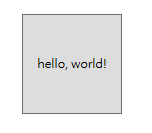
代码就像这样:
<Button Width="100" Height="100">
    <TextBlock Text="hello, world!" />
</Button>
你会发现你无法为它再赋予 Content 了,编辑器会告诉你属性重复,也就是说,你在 xaml 里面写的 Text 属性为"hello, world!" 的文本块 TextBlock 控件,已经是 Button 的 Content 属性了。
所以,我想要说什么?
Content 这个依赖属性能描述的不仅是一个字符串,它实际上能描述一个对象,它的类型其实是 object,我们去看它的定义就可以知道:
public object Content { get; set; }
正是因为 Content 是 object 类型,而 Text 属性接收的要求是 string 字符串,所以 VS 在智能提示的时候并不认为它们俩合适,所以我们在智能提示的时候根本找不到它。
那,为什么我们直接写还是能够生效?
对于 Text 这种字符串类型来说,我们恰好传的是 string 字符串这个对象,瞎猫碰上死耗子,自然就没有发现问题。
所以,如果我们的自定义样式有内部嵌套的对象,它在使用 TemplateBinding 写法的我们的样式里,是完全没有反应的。
如果说你真的要让只能接收到 string 的 Text 依赖属性,被迫吃下那么一坨,不就是 object 吗,只要是个 object ,使用 ToString() 转成字符串不就好了么。于是,你可以使用上文提到的那种非常冗长的写法。
于是就会有这样的效果:
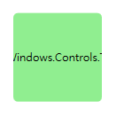
<Style x:Key="Button_Test_Style" TargetType="Button">
    <Setter Property="Template">
        <Setter.Value>
            <ControlTemplate TargetType="Button">
                <Grid>
                    <Border Background="{TemplateBinding Background}" CornerRadius="5" />
                    <TextBlock
                        HorizontalAlignment="Center"
                        VerticalAlignment="Center"
                        Text="{Binding RelativeSource={RelativeSource Mode=TemplatedParent}, Path=Content}" />
                </Grid>
            </ControlTemplate>
        </Setter.Value>
    </Setter>
</Style>
<Button
    Width="100"
    Height="100"
    Background="LightGreen"
    Style="{StaticResource Button_Test_Style}">
    <TextBlock Name="PART_TextBlock" Text="hello, world!" />
</Button>
为了实现 Button 内部控件的嵌套和对象的嵌套呈现,用我们目前的 TextBlock 来呈现内容是完全不可取的。
实际上一个标准的 Button 实现会使用 ContentPresenter 来呈现,ContentPresenter 本身具备的 Content 依赖属性才是 Button 的 Content 的依赖属性最终的去处。
<Style x:Key="Button_Test_Style" TargetType="Button">
    <Setter Property="Template">
        <Setter.Value>
            <ControlTemplate TargetType="Button">
                <Grid>
                    <Border Background="{TemplateBinding Background}" CornerRadius="5" />
                    <ContentPresenter
                        HorizontalAlignment="Center"
                        VerticalAlignment="Center"
                        Content="{TemplateBinding Content}" />
                </Grid>
            </ControlTemplate>
        </Setter.Value>
    </Setter>
</Style>
这个样式的效果是这样的:
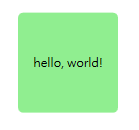
代码:
<Button
    Width="100"
    Height="100"
    Background="LightGreen"
    Style="{StaticResource Button_Test_Style}">
    <TextBlock Name="PART_TextBlock" Text="hello, world!" />
</Button>
我们现在能知道的是,对于字符串类型的 Content 会显示一串文字,如果填入的是控件内容,它会显示控件 UI 的样子,用来为按钮创建图标等相关需求的时候会非常有用。
可是,object 也就意味着是所有类型,我们自己的 class 实例对象给它会是什么样子?
让我们在 Button 初始化的时候在 C# Code-Behind 代码的部分创建一些内容吧!
这是我们自定义的类:
public class Person
{
    public string Name { get; set; }
    public int Age { get; set; }
}
请注意 xaml 中关于 Loaded="Button_Loaded" 的部分。
<Button
    Width="100"
    Height="100"
    Background="LightGreen"
    Loaded="Button_Loaded"
    Style="{StaticResource Button_Test_Style}" />
这是事件订阅后要执行的事情。
private void Button_Loaded(object sender, RoutedEventArgs e)
{
    var button = sender as Button;
    if (button is null) return;

    // 虽然可以写成 button!.Content 但是怕各位看不懂
    button.Content = new Person() { Name = "小明", Age = 18 };
}
这是效果:
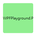
因为我们的项目叫做 WPFPlayground,所以 Person 这个对象被 ToString()后得到的结果是 WPFPlayground.Person 因为尺寸有限所以目前呈现的是这样。
我们希望把信息显示出来,你可以这样完善 Person 的内容:
public class Person
{
    public string Name { get; set; }
    public int Age { get; set; }

    public override string ToString()
    {
        return $"{Name}: {Age} !!!!!";
    }
}
效果就会变成这样:
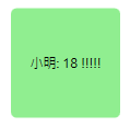
但是有的时候,我们希望呈现的数据也是有布局和 UI 的。
因为自定义数据的属性并不是依赖属性,所以上面在控件模板中介绍的那些方法,TemplateBinding 之类的做法在这边就完全失效了。
面对这个数据的外观定义,你要使用 ContentTemplate 来做。
当然,ContentTemplate 内容模板和 ControlTemplate 控件模板长得很像,但是不一样的概念,ContentTemplate 和 Content 是一对内容,相互配合才能实现最好的效果,作为 Content 的好兄弟,ContentTemplate 自然也是依赖属性,在 ContentPresenter 中发挥作用。
我们说了这么多话,到底想要说什么?
我想说的是,光写 Button 中的 ContentTemplate 是没有用的,因为实际承担工作的是 你的 ControlTemplate 控件模板的 ContentPresenter,你需要把这个依赖属性作为参数传递进去,写成这个样子:
<Style x:Key="Button_Test_Style" TargetType="Button">
    <Setter Property="Template">
        <Setter.Value>
            <ControlTemplate TargetType="Button">
                <Grid>
                    <Border Background="{TemplateBinding Background}" CornerRadius="5" />
                    <ContentPresenter
                        HorizontalAlignment="Center"
                        VerticalAlignment="Center"
                        Content="{TemplateBinding Content}"
                        ContentTemplate="{TemplateBinding ContentTemplate}" />
                </Grid>
            </ControlTemplate>
        </Setter.Value>
    </Setter>
</Style>
然后,我们将开始面对 DataTemplate 了。
我们为 Button 在更新了 Style 后,编写了对应的 ContentTemplate。
ContentTemplate 的类型是 DataTemplate,集合容器所采用的 ItemTemplate 类型也是 DataTemplate 其实也是 DataTemplate,因为其中的原理其实就是每一项套了一个 ContentPresenter 内容呈现器。
<Button
    Width="100"
    Height="100"
    Background="LightGreen"
    Loaded="Button_Loaded"
    Style="{StaticResource Button_Test_Style}">

    <Button.ContentTemplate>
        <DataTemplate DataType="local:Person">
            <StackPanel>
                <TextBlock Background="Yellow" Text="{Binding Name}" />
                <TextBlock
                    Background="Aqua"
                    FontSize="20"
                    Text="{Binding Age}" />
            </StackPanel>
        </DataTemplate>
    </Button.ContentTemplate>

</Button>
会变成这样的效果:

于是,在控件和主题上,你可以为 ControlTemplate 方面打一个坚实的底子用于项目风格的复用,而在自定义数据特别是业务数据的呈现上,以 ContentTemplate 为代表的 DataTemplate,会为你带来业务上的拓展性。
我们来创建一个毫无通知能力,只是好看的 ViewModel,并不实现 INotifyPropertyChanged。
public class MainViewModel
{
    public List<Person> Persons { get; set; }
    public MainViewModel()
    {
        Persons = new List<Person>()
        {
            new Person(){ Name = "小明", Age = 18},
            new Person(){ Name = "小红", Age = 17},
            new Person(){ Name = "小黄", Age = 16},
            new Person(){ Name = "小亮", Age = 11},
            new Person(){ Name = "小军", Age = 19},
            new Person(){ Name = "小帅", Age = 30},
            new Person(){ Name = "小马", Age = 6},

        };
    }
}
我相信你知道怎么绑定上下文,所以这边只做了绑定的部分:
<ItemsControl ItemsSource="{Binding Persons}" />
我们来看一下效果:
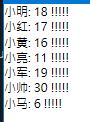
你可以注意到的是,集合容器控件中呈现的样子,和我们刚才描述的关于 ContentPresenter 和 Content 的机制是完全一致的。
让我们把上面写的 ContentTemplate 中的 DataTemplate 交给 ItemsControl 的 ItemTemplate 中去。
<ItemsControl ItemsSource="{Binding Persons}">
    <ItemsControl.ItemTemplate>
        <DataTemplate DataType="local:Person">
            <StackPanel>
                <TextBlock Background="Yellow" Text="{Binding Name}" />
                <TextBlock
                    Background="Aqua"
                    FontSize="20"
                    Text="{Binding Age}" />
            </StackPanel>
        </DataTemplate>
    </ItemsControl.ItemTemplate>
</ItemsControl>
现在的效果就是这样的:
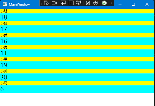
具体 ItemTemplate 生效的原因来自于 ContentPresenter,参看源码:https://referencesource.microsoft.com/#PresentationFramework/src/Framework/System/Windows/Controls/ItemsControl.cs,a32a4ab17d3998f0,references
你可能会对 ItemsControl 和 ListBox 的默认的 StackPanel 纵向布局感到不满。
这个时候你可以使用 ItemsPanel 创建 ItemsPanelTemplate 对象,它是属于 ControlTemplate 相似的,和数据无关的 Template。
默认情况如果写出来是这样的:
<ItemsControl ItemsSource="{Binding Persons}">
    <ItemsControl.ItemTemplate>
        <DataTemplate DataType="local:Person">
            <StackPanel>
                <TextBlock Background="Yellow" Text="{Binding Name}" />
                <TextBlock
                    Background="Aqua"
                    FontSize="20"
                    Text="{Binding Age}" />
            </StackPanel>
        </DataTemplate>
    </ItemsControl.ItemTemplate>

    <ItemsControl.ItemsPanel>
        <ItemsPanelTemplate>
            <StackPanel />
        </ItemsPanelTemplate>
    </ItemsControl.ItemsPanel>

</ItemsControl>
我如果在使用它,一般我会使用它的 WrapPanel 和 Horizontal StackPanel。
效果:
WrapPanel 的可折叠性。
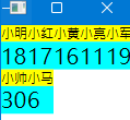
代码:
<ItemsControl.ItemsPanel>
    <ItemsPanelTemplate>
        <WrapPanel />
    </ItemsPanelTemplate>
</ItemsControl.ItemsPanel>
效果:
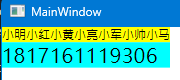
代码:
<ItemsControl.ItemsPanel>
    <ItemsPanelTemplate>
        <StackPanel Orientation="Horizontal" />
    </ItemsPanelTemplate>
</ItemsControl.ItemsPanel>
这是 DataGrid 的默认样子:
<DataGrid ItemsSource="{Binding Persons}" />
除了显示一些栏位字段属性之外,你可能希望能本来的数据源中显示一些别的控件,比如我们上面定义的 DataTemplate,来帮助我们更加可视化的看到数据。
你可以实现这样的效果:
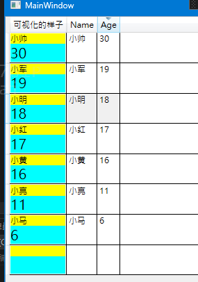
代码如下:
<DataGrid ItemsSource="{Binding Persons}">
    <DataGrid.Columns>
        <DataGridTemplateColumn Header="可视化的样子">
            <DataGridTemplateColumn.CellTemplate>
                <DataTemplate DataType="local:Person">
                    <StackPanel>
                        <TextBlock Background="Yellow" Text="{Binding Name}" />
                        <TextBlock
                            Background="Aqua"
                            FontSize="20"
                            Text="{Binding Age}" />
                    </StackPanel>
                </DataTemplate>
            </DataGridTemplateColumn.CellTemplate>
        </DataGridTemplateColumn>
    </DataGrid.Columns>
</DataGrid>
推荐用法:可以用来显示重要程度比如红色绿色、进度百分比等等效果,具体想要可视化什么取决于业务需求。
| 属性名 | 类型 | 用法 |
|---|---|---|
| Template | ControlTemplate | 在 Control 控件中的 Template 属性,是 WPF 最为基础的内容,是所有控件的可复用性的保障,通常和 Style 搭配,编写 ControlTemplate 就好比在 xaml 中编写函数一样,具有非常重要的工程意义。 |
| ContentTemplate | DataTemplate | 所有 ContentControl(如 Button)实现,会在控件模板 ControlTemplate 中的某些 ContentPresenter 将会承担解析和呈现它们的任务,前提是你需要传递过去。 |
| ItemTemplate | DataTemplate | 集合容器之所以能够呈现内容就是因为它每一项都是一个 ContentPresenter,容器将会把定义的 ItemTemplate 信息交给每一个 ContentPresenter 的 ContentTemplate 中,把每一项的数据信息交给 ContentPresenter 的 Content 中,最后实现列表项的呈现,具体会有 ItemsPresenter 的参与 |
| ItemsPanel | ItemsPanelTemplate | 属于 ItemsControl 和 ListBox 等数据呈呈现容器,用于描述每一项应该如何排布,默认是 StackPanel Vertical 布局,你完全可以改成 WrapPanel,Canvas,StackPanel Horizontal,Grid 等等的布局容器 |
| CellTemplate | DataTemplate | WPF 出于 DataGrid 更好可视化的角度为你提供的办法 |

 关注微信
关注微信